OVERVIEW AND BRIEF
Icarus Entertainment and Purly approached Studio DZNS with a simple but ambitious brief: bring horror to the main stage without making the event feel predictable or low-budget. The concert was headlined by Talwiinder and needed to feel premium, culturally current and visually disruptive.
My responsibility was to shape a campaign that could build anticipation around a 2,000+ capacity show while remaining faithful to Talwiinder’s dark, new-generation visual identity. The communication had to feel like a concert campaign first and a Halloween campaign second, rather than relying on generic seasonal imagery.
MY CREATIVE APPROACH
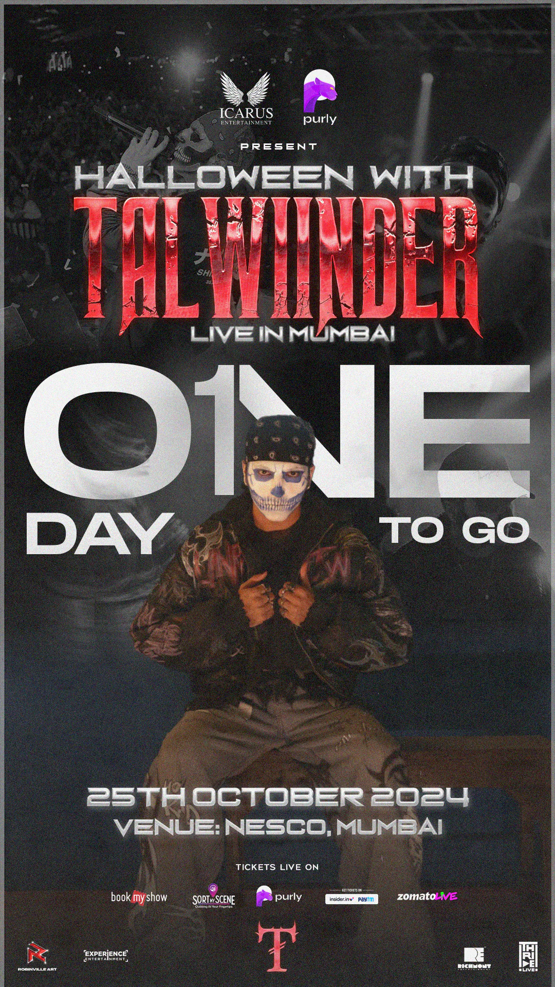
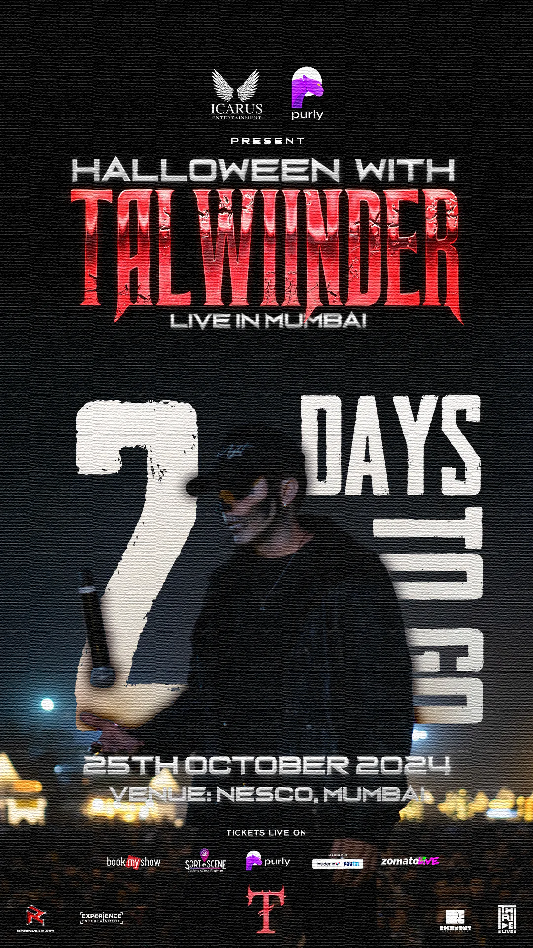
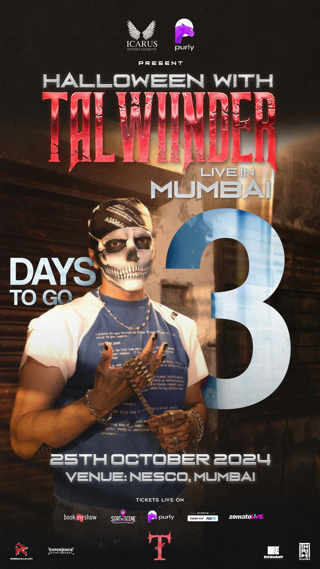
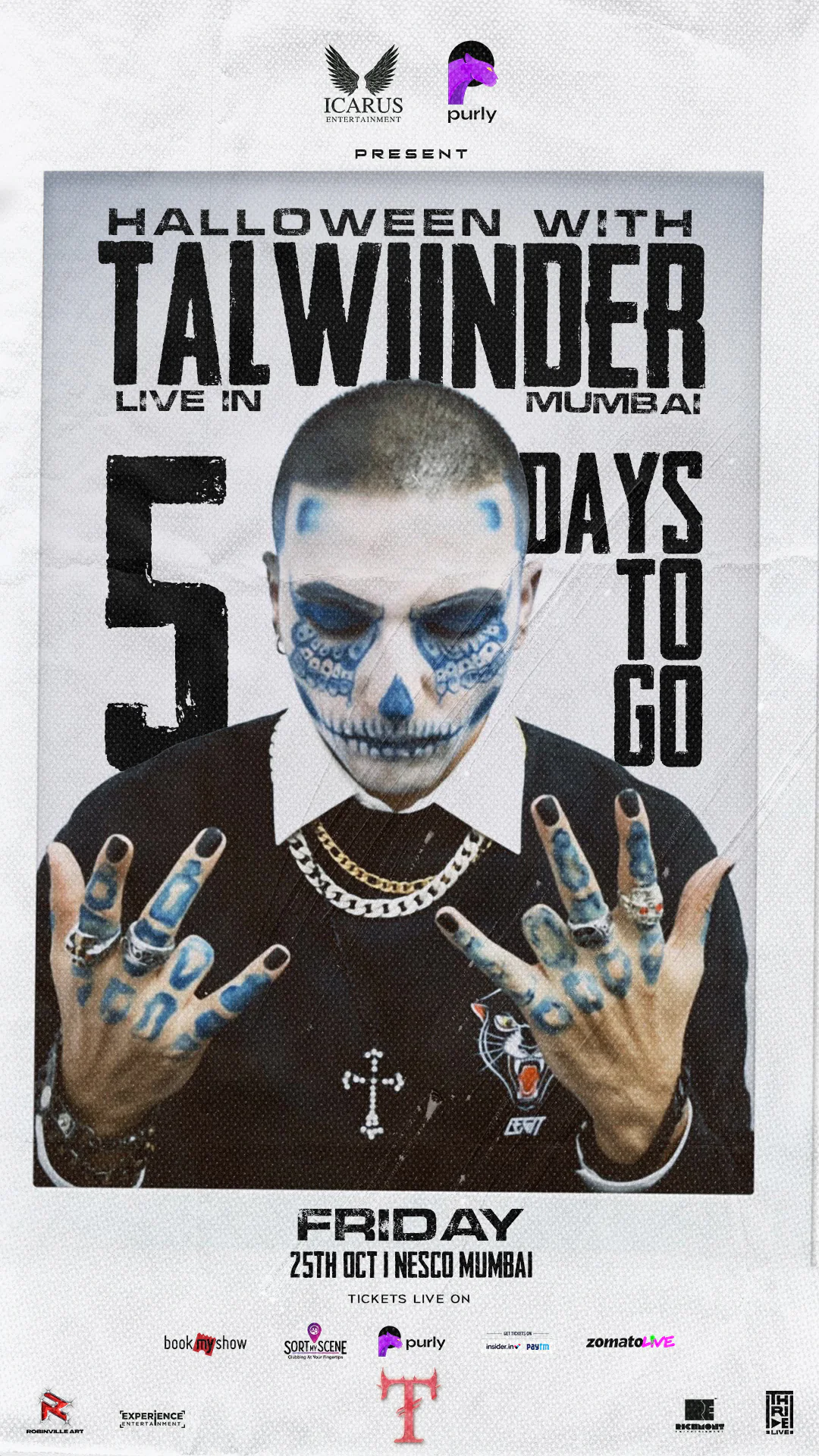
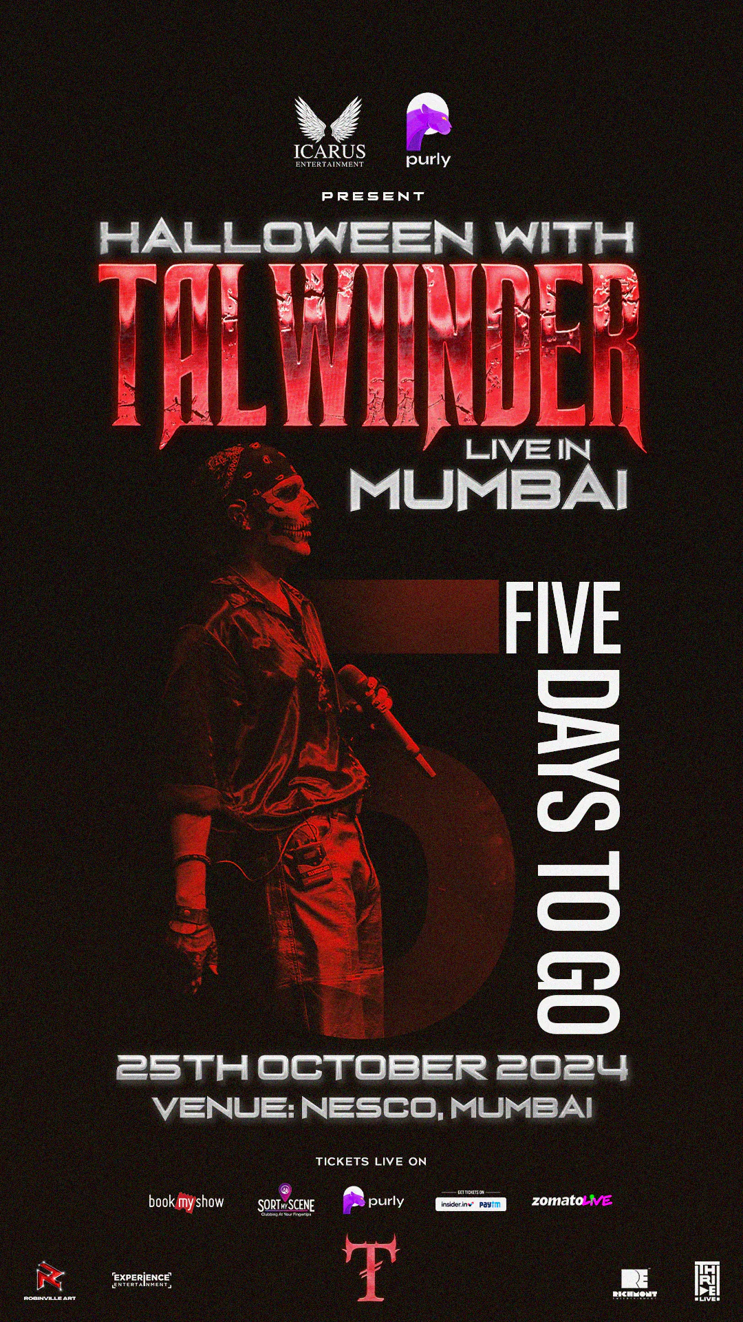
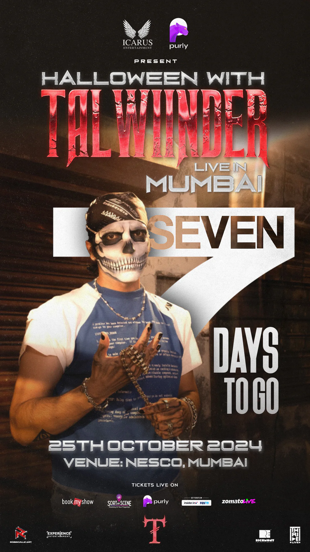
I led the visual direction around cinematic horror, using blood-red chrome textures, custom title treatments, gritty shadows and atmospheric compositions. I wanted the campaign to feel aggressive and theatrical, but still controlled enough to work across premium ticketing and partner platforms.
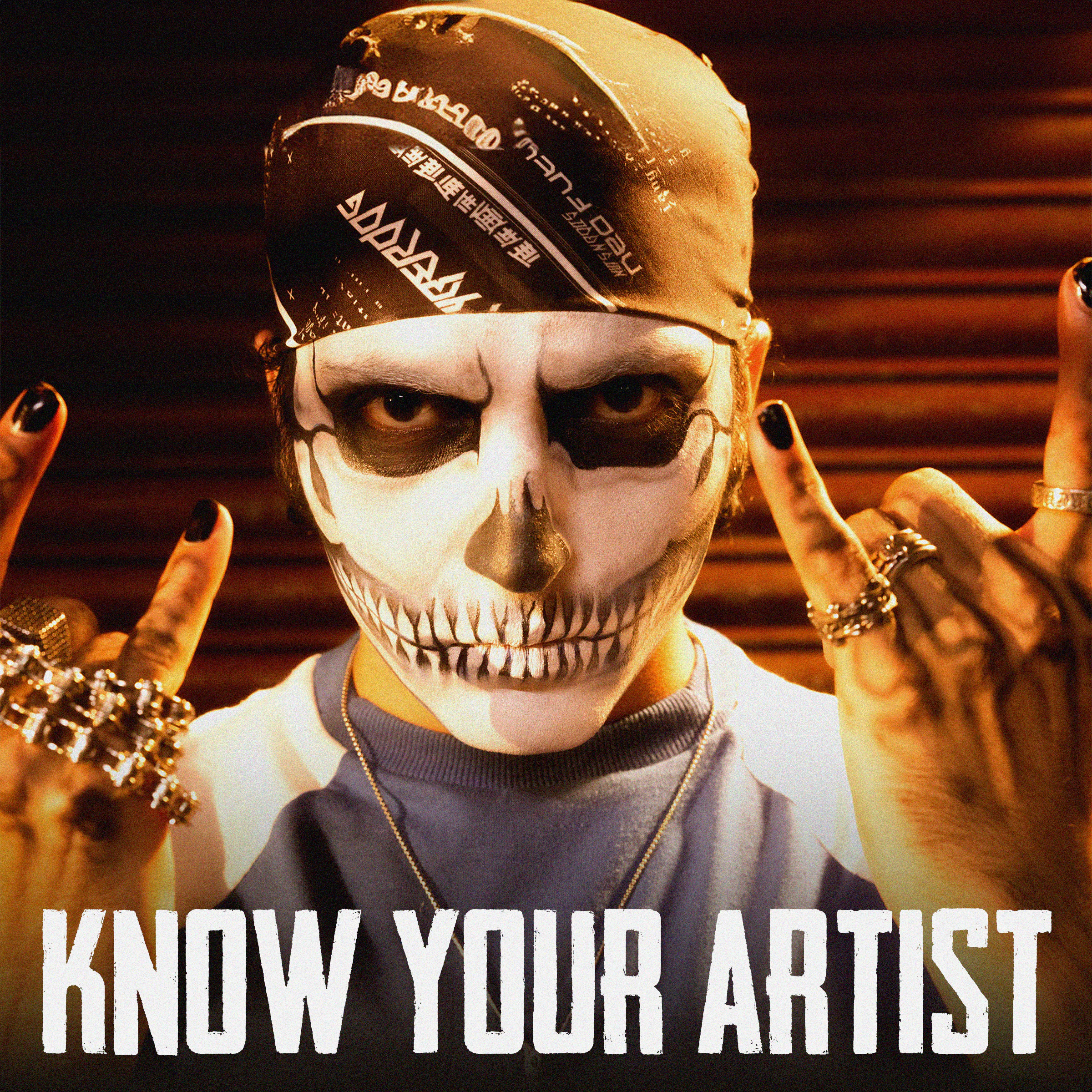
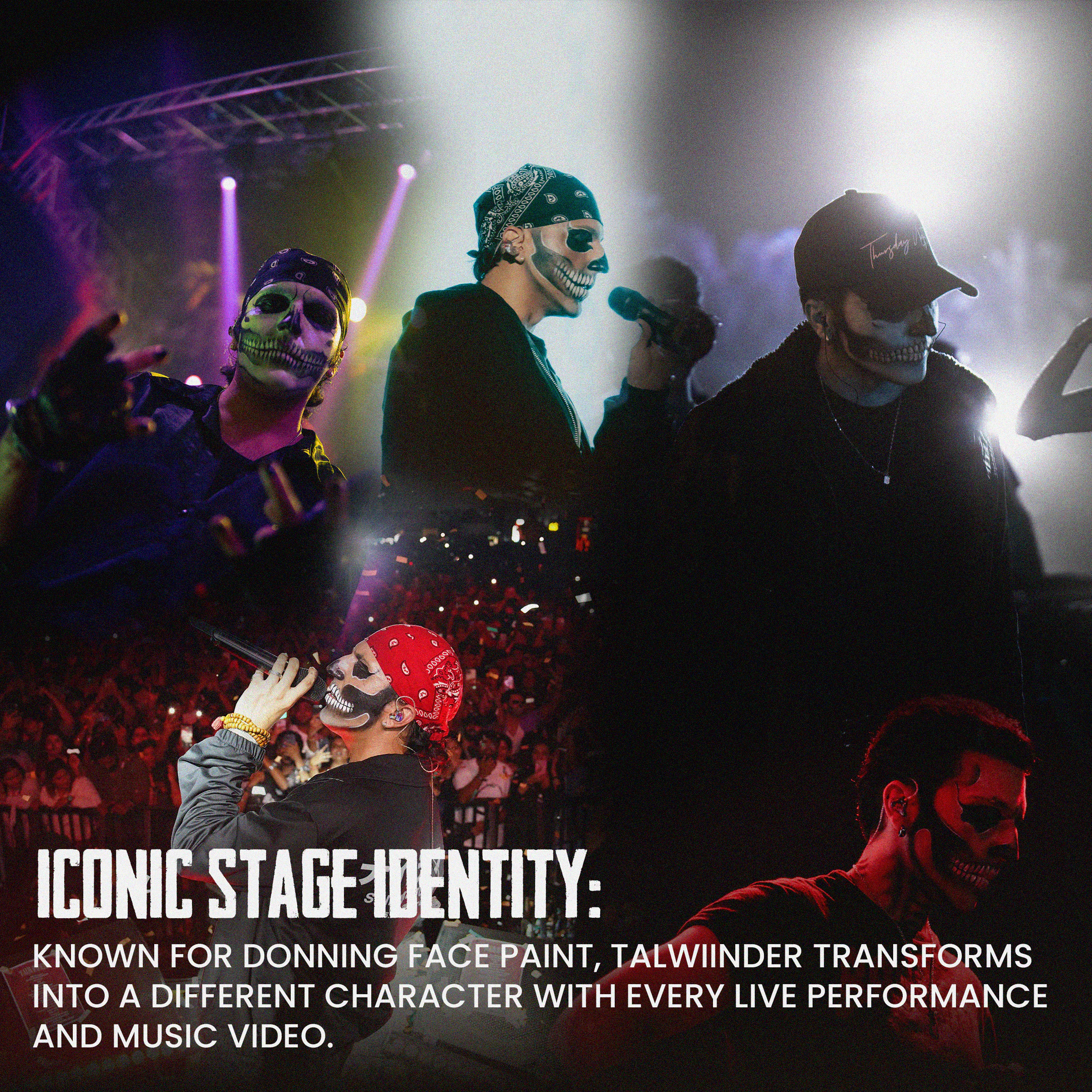
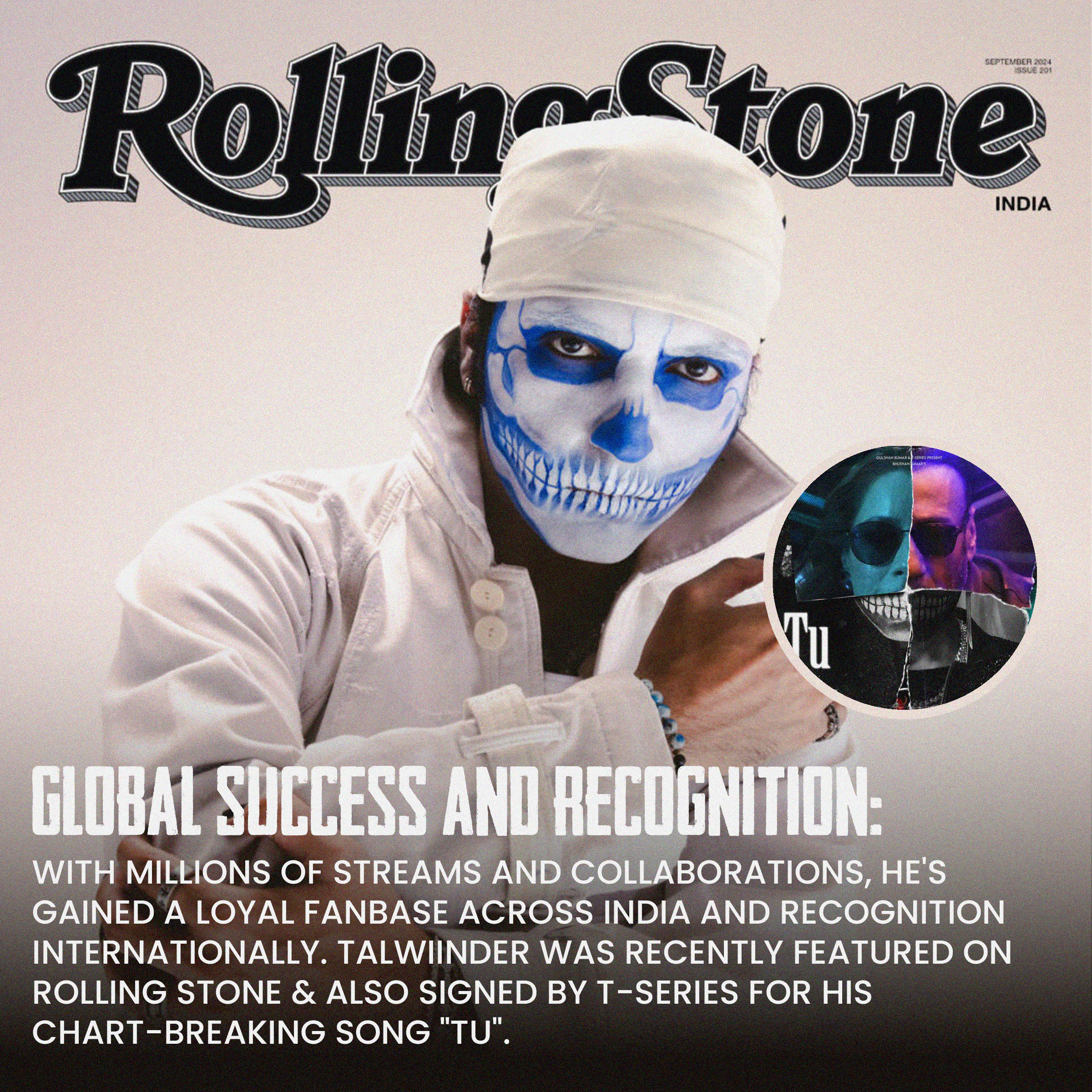
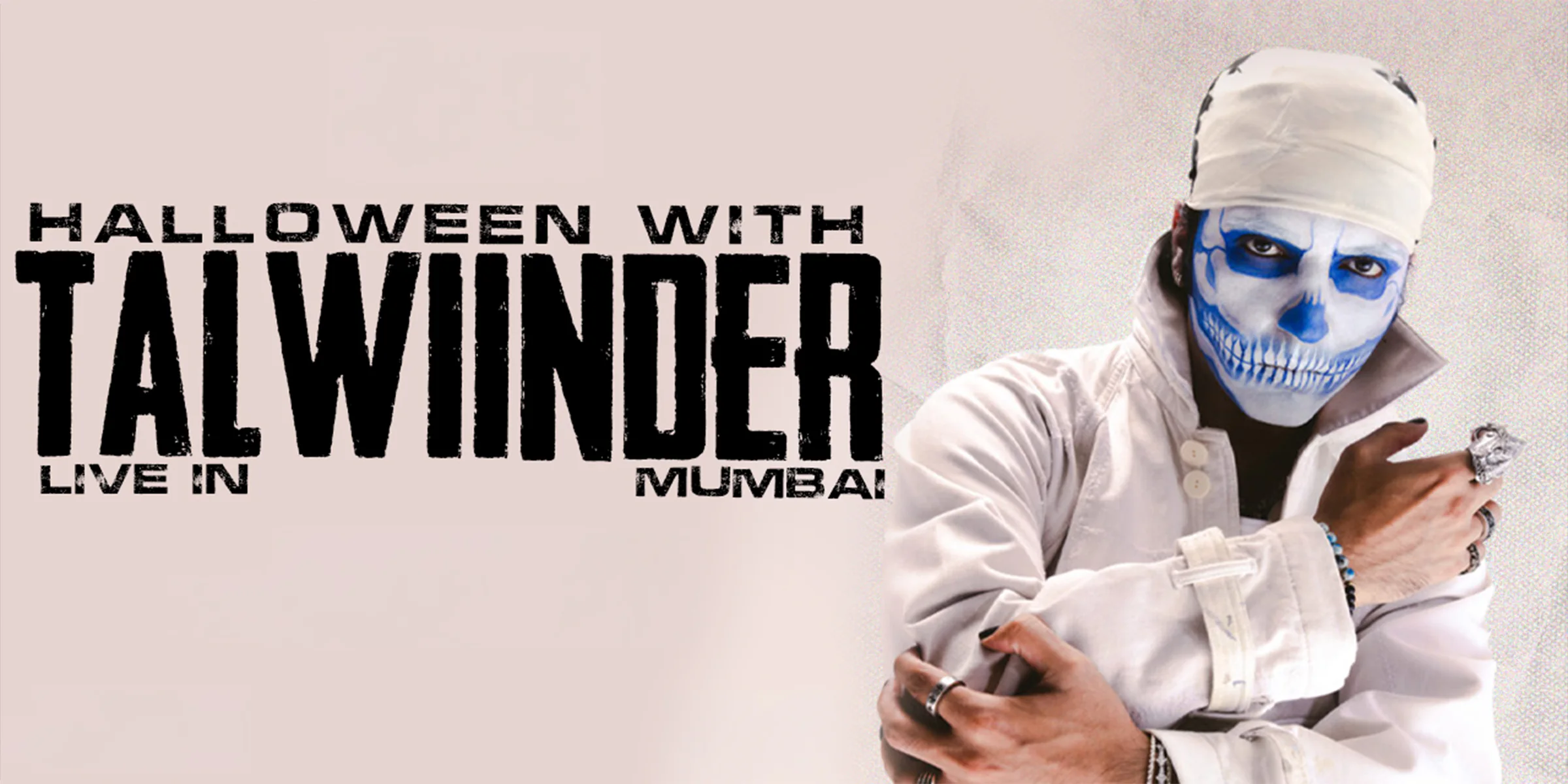
Instead of using obvious Halloween symbols such as pumpkins, witches or cartoon ghosts, I built the visual language around Talwiinder’s skull-inspired makeup, dark red lighting, smoke, skeletal accents and distressed typography. This gave the campaign a stronger connection to the artist while still communicating the occasion immediately.
I also established a modular design system so that the same visual language could be adapted across feed posts, stories, reels, paid advertisements and partner announcements without losing consistency.
CHALLENGES AND EXECUTION
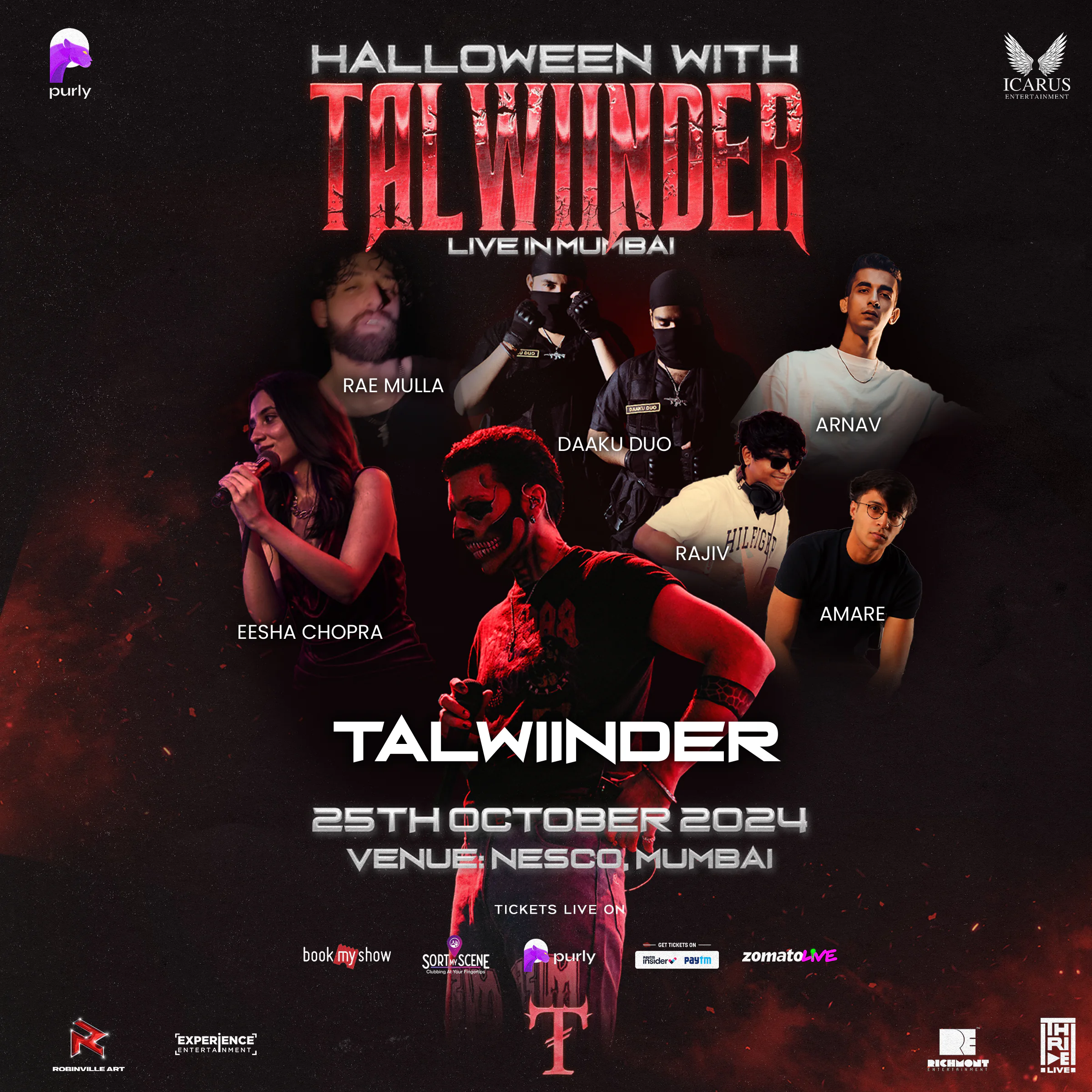
The main challenge was maintaining clear brand recall across multiple platforms while allowing the artist to remain the dominant visual focus. I used controlled hierarchy, repeated textures and consistent typography so that every asset felt connected even when the information changed.
The campaign also moved quickly as ticket phases began selling. I worked with my team to respond to live updates, including sold-out announcements, revised calls to action, lineup changes and urgency-led motion content. Several updates had to be turned around within 12 to 18 hours.
The final rollout included a hero poster series, a large-scale NESCO venue reveal, ticketing-phase creatives, lineup and set-time communication, high-intensity reels, artist introductions and interactive stories. Across the campaign, more than 50 creative assets were produced.
IMPACT AND RESULTS
Phase 1 and Early Bird tickets sold out within days. Stories and reels crossed 100,000+ organic views within a week, and the campaign developed strong recall across Mumbai’s nightlife audience.
The posters were widely reshared by partner and community pages, and elements of the visual language were repeated across promotional channels. The event ultimately sold out and delivered a packed show at NESCO.
MY CONTRIBUTION AND TAKEAWAY
I led the visual direction, campaign design system, graphic and illustration approach, motion direction and content-rollout logic. I also oversaw how sponsor, partner and ticketing information was integrated without weakening the core identity.
This project taught me how to create a strong thematic world without allowing the theme to overpower the artist. It also improved my ability to make fast creative decisions under live campaign pressure.