OVERVIEW
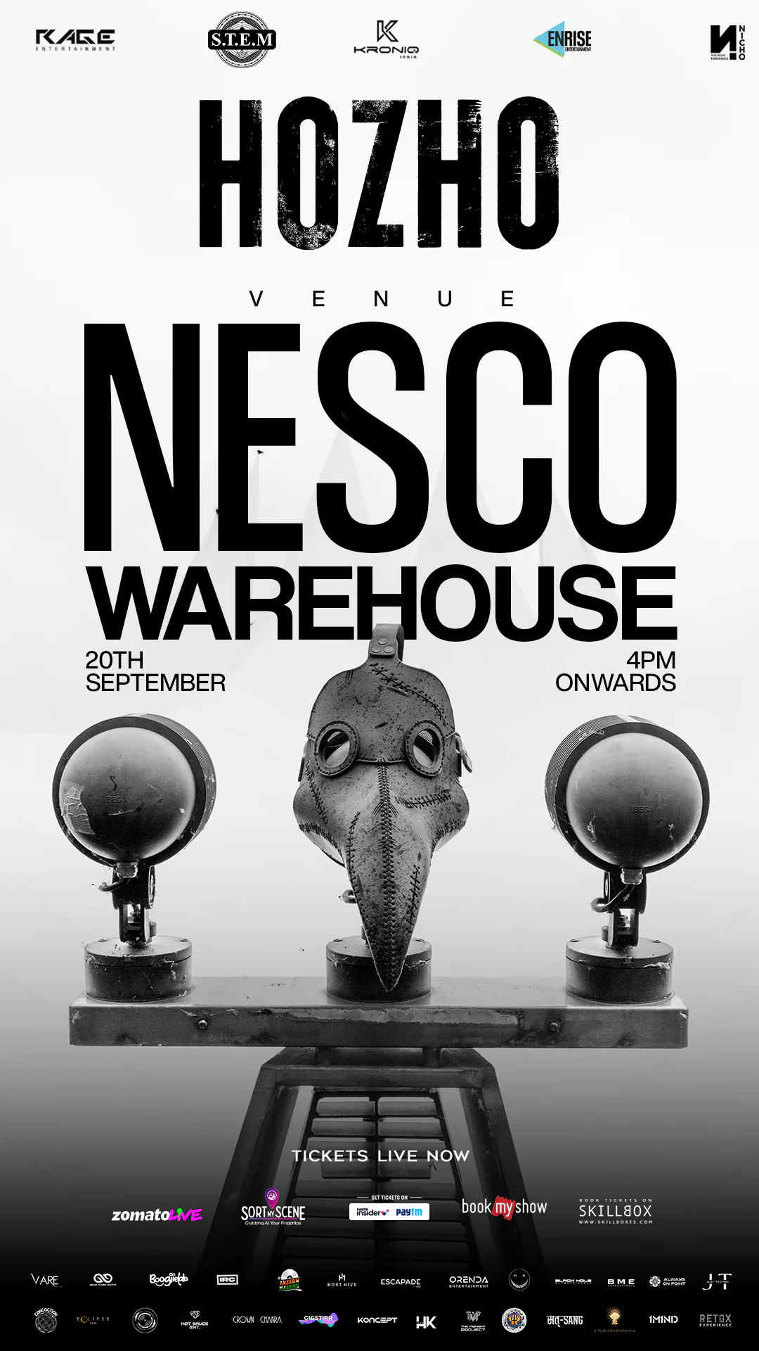
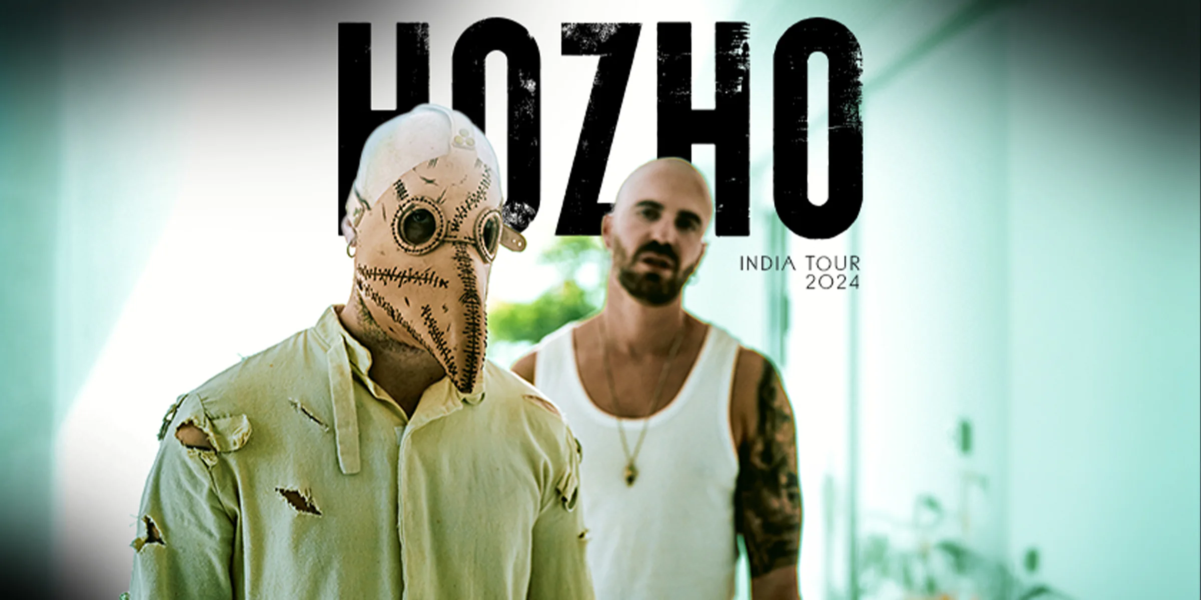
HOZHO’s Mumbai performance was set inside an industrial warehouse at NESCO and needed a campaign that could translate his enigmatic melodic-techno persona into a larger event identity.
I led the creative direction through Studio DZNS for a full month of communication, combining daily social releases, motion content and supporting decks. The challenge was to sustain mystery while still communicating enough practical information to move audiences toward conversion.
CREATIVE DIRECTION
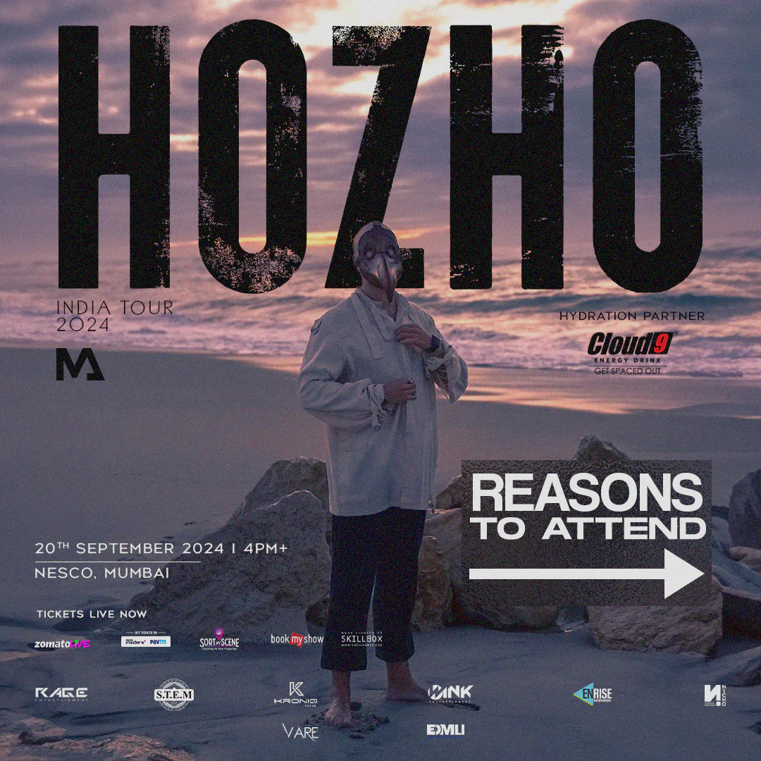
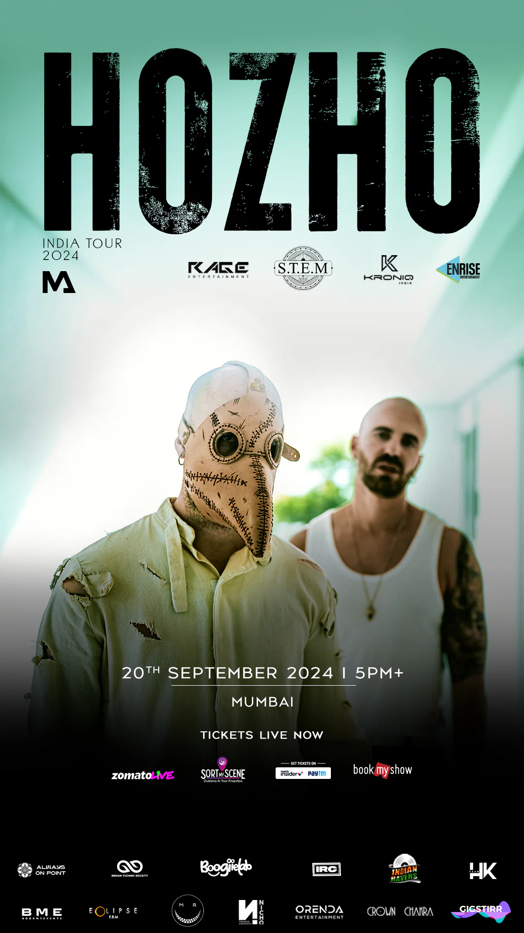
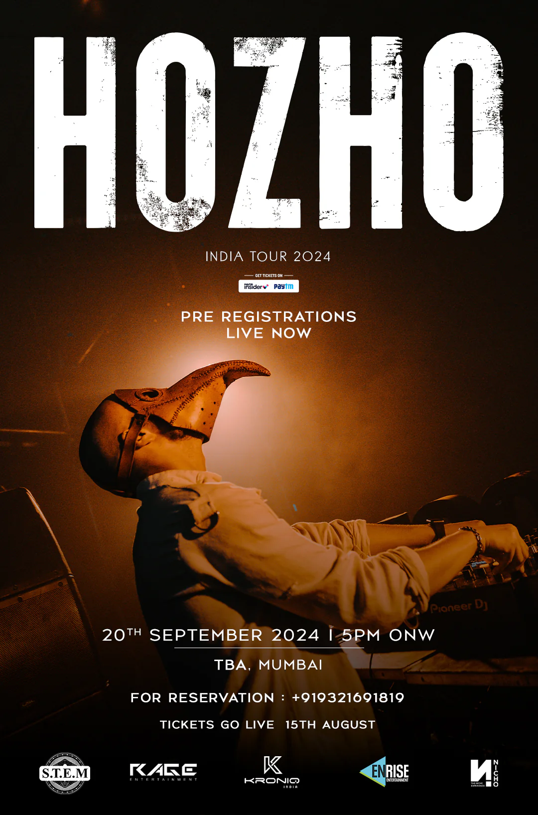
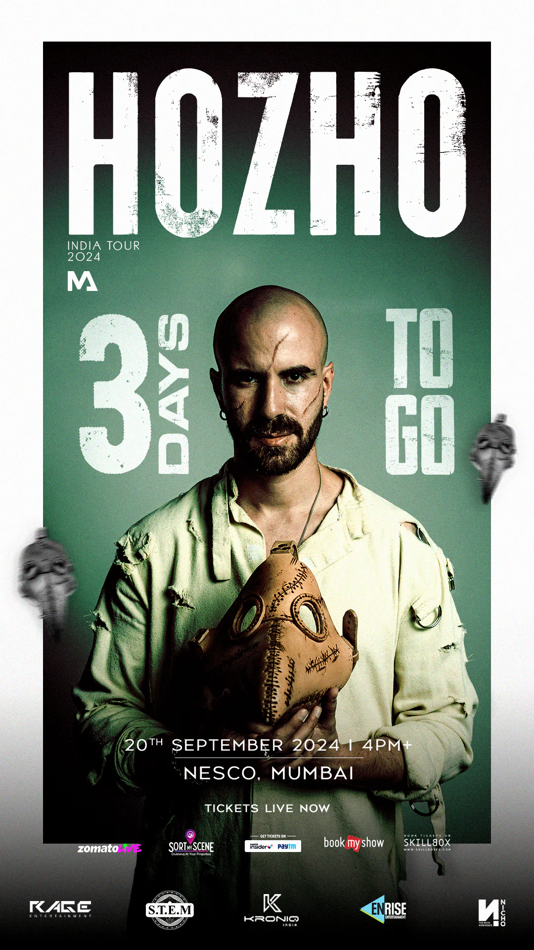
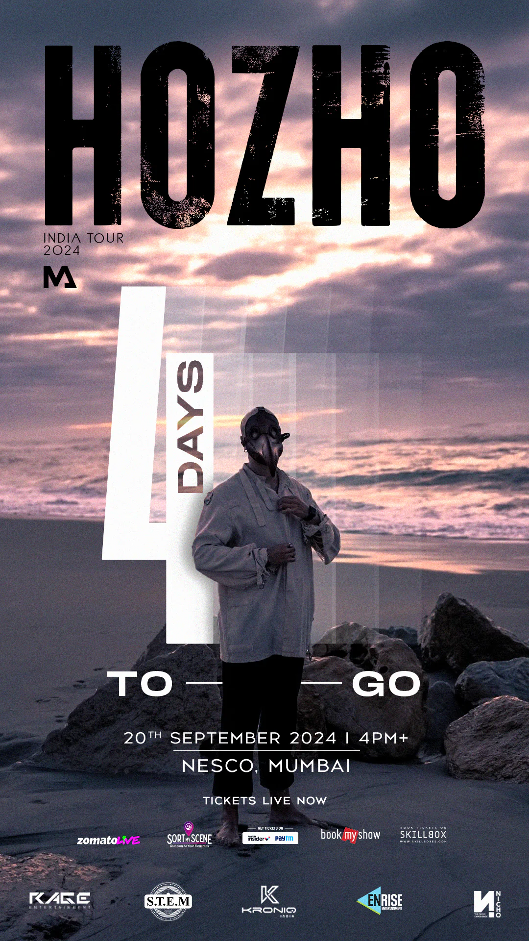
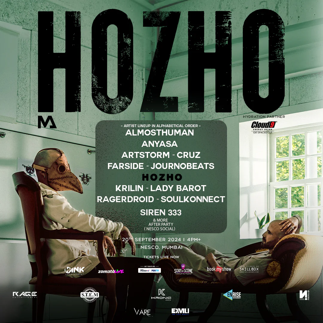
I centred the visual identity around HOZHO’s plague-doctor mask and noir-inspired performance persona. The system combined sharp monochrome imagery, deep green accents, textured typography and controlled asymmetry.
The result was dark and haunting, but it remained polished enough for a major tour campaign. I avoided filling every asset with effects; instead, I used recurring shapes, tonal contrast and the mask as a consistent anchor.
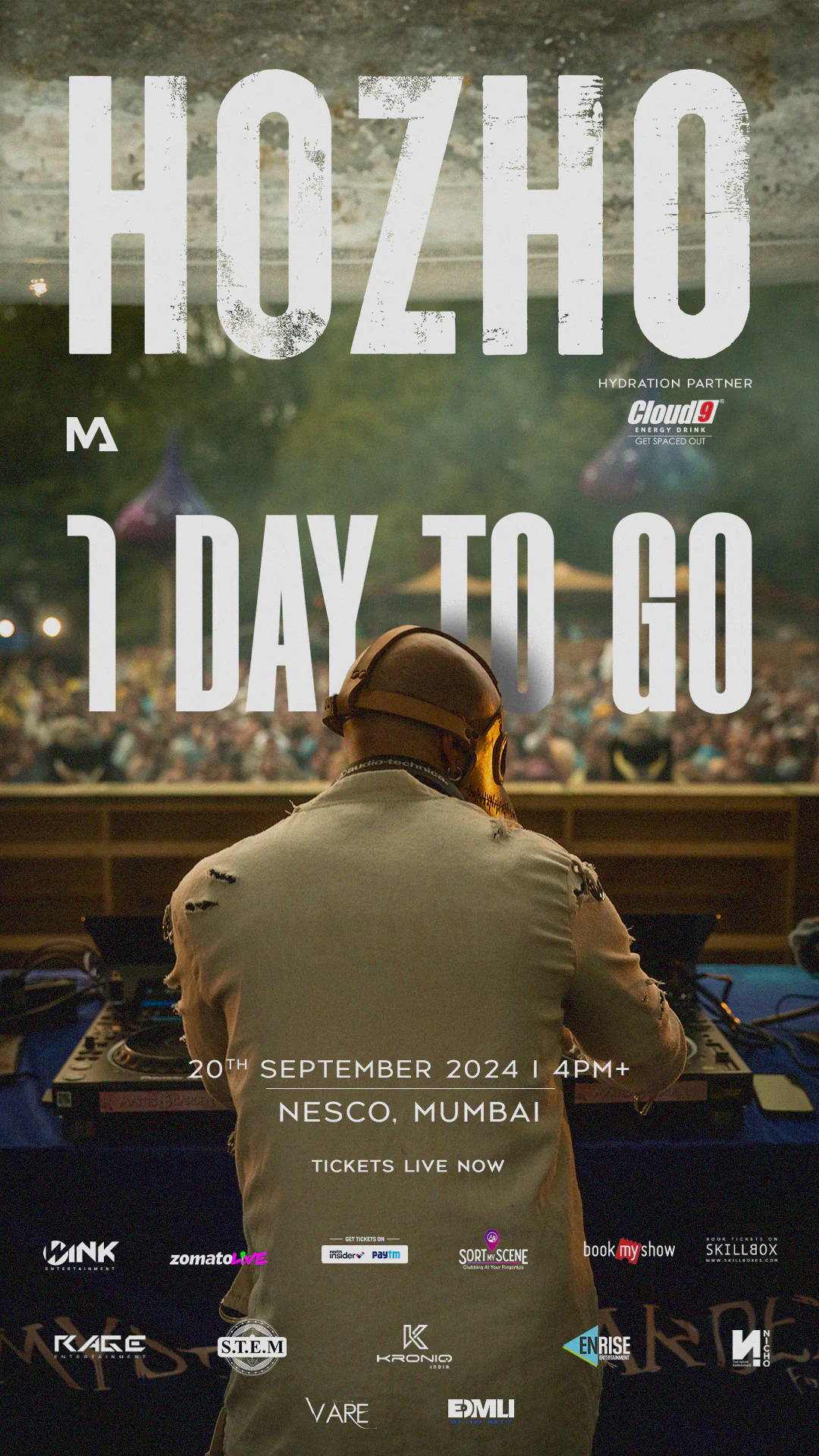
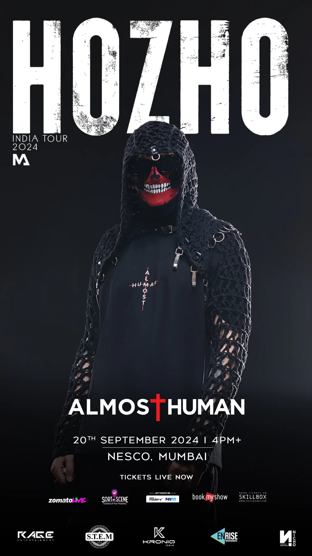
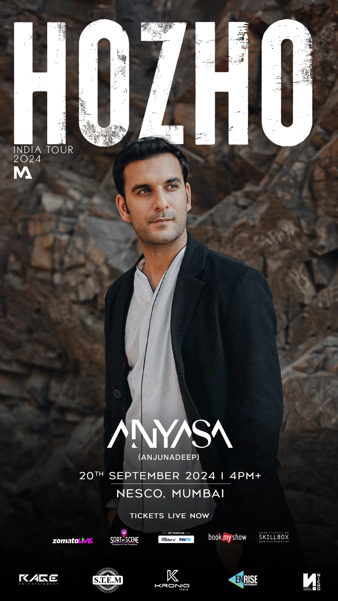
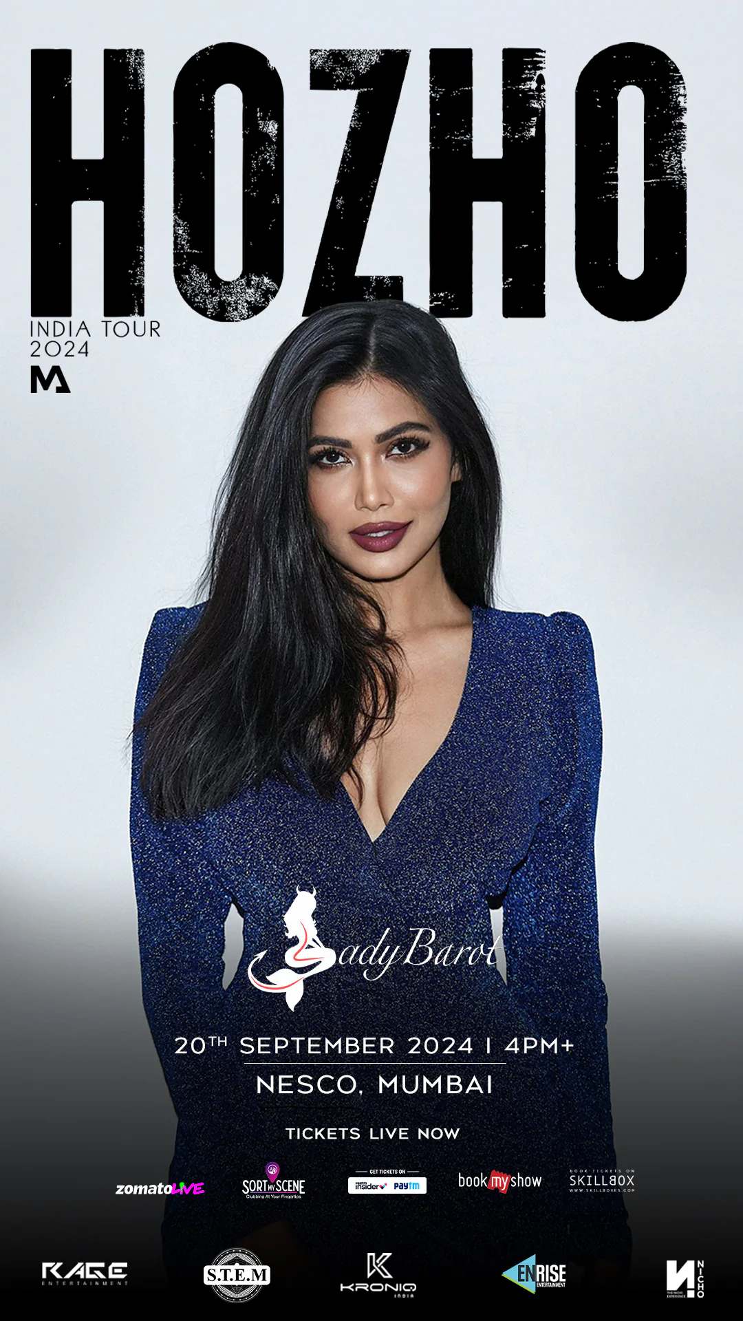
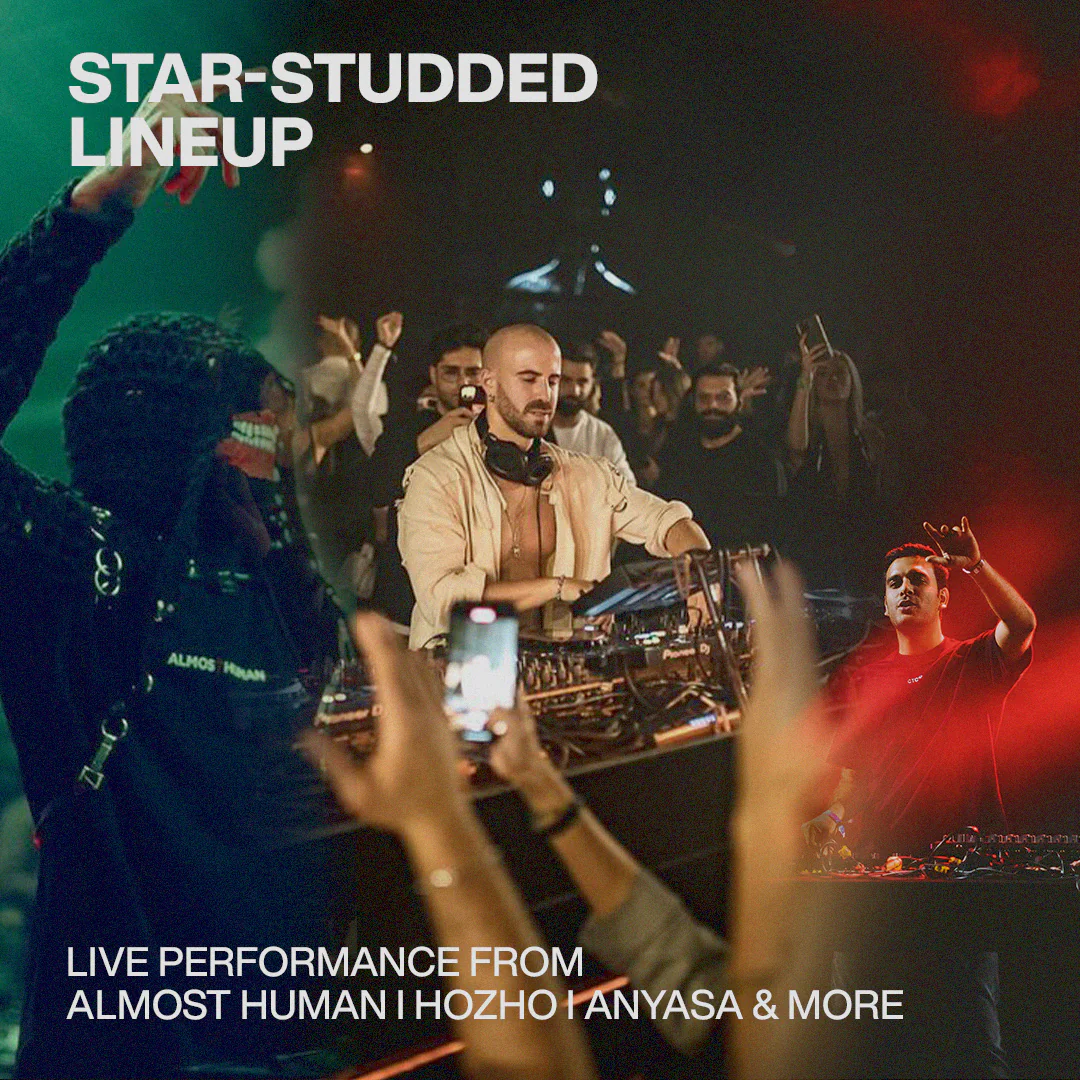
The core deliverables included Mumbai tour posters, cinematic motion graphics, a 10+ artist lineup system, vertical countdown animations and 3D-led venue-reveal visuals.
DAILY CAMPAIGN SYSTEM
I structured the rollout around a story-first sequence. The pre-registration phase introduced the world through a cinematic teaser and reservation communication. The countdown then introduced a new visual motif each day using glitch treatments, film frames and raw artist imagery.
‘Know Your Artist’ reels added accessible context for HOZHO and the supporting lineup. Ticket-phase updates used clean modular layouts so that sold-out information could be published quickly without disrupting the overall identity.
I also directed the lineup decks and production collateral, including sponsor decks, stage-layout maps, artist packs and swappable story templates. These assets were designed for quick use by promoters, artists and partners.
IMPACT AND RESULTS
Phase 1 tickets sold out within 48 hours. Reels and motion content crossed 110,000 organic views, while the campaign drove the Instagram profile to more than 280,000 unique accounts.
Major Indian music pages reposted the visuals without modification. The combined lineup and venue-announcement story also recorded the highest tap-through rate among that month’s events on SortMyScene.
MY CONTRIBUTION AND TAKEAWAY
I led the visual identity, campaign design, countdown system, motion direction, daily rollout plan and deck structure. I worked to ensure that every asset supported the same narrative while remaining practical for a fast-moving promoter network.
The project taught me how to create controlled variation: enough change to keep a month-long campaign engaging, but enough repetition to build recognition.